


Review – Tuesday 18th October
Specialten Magazine DVD
What impressed me with this DVD was the design of the interface transitions. Once selecting a video, the interface transforms from a 2D design to a 3D landscape. The viewer is transported through the virtual landscape to reach their chosen destination. Upon arrival, they are presented with further information about their chosen video. This journey the viewer takes through the virtual landscape makes the experience of using the DVD more interactive. The 3D transitions heighten the enjoyment of selecting a video for the viewer. It is more sensuous experience than simply being presented with another 2D still. Within a black, universe-like landscape neon shapes collide to form part of the visual landscape. The movement of vivid colours combines with an interesting soundscape to fascinate the viewer as they move from one area to the next.
A criticism of the Specialten DVD was the use of rollovers. An opaque pink block was used to illustrate to the user which button they were over. Although the colour was in keeping with the design of the interface, the rollover state obscured the white text of the button, making it difficult to read. It also seemed to dull the otherwise luminescent colours used in the graphics. I think the rollover state was used in too subtle a way for this DVD and I could not always see it on the screen. I found this was the case particularly when using a DVD projector, but also on a computer monitor. This meant that at times I was not always clear where I was navigating to within the interface, a problem that would be worse for someone with a visual impairment. I also felt that not as much thought had gone into this aspect of the DVD production. The rollover state offers another opportunity for creative experimentation in its use, but on this DVD it felt flat and conventional which was not in keeping with the overall creative design of the interface.
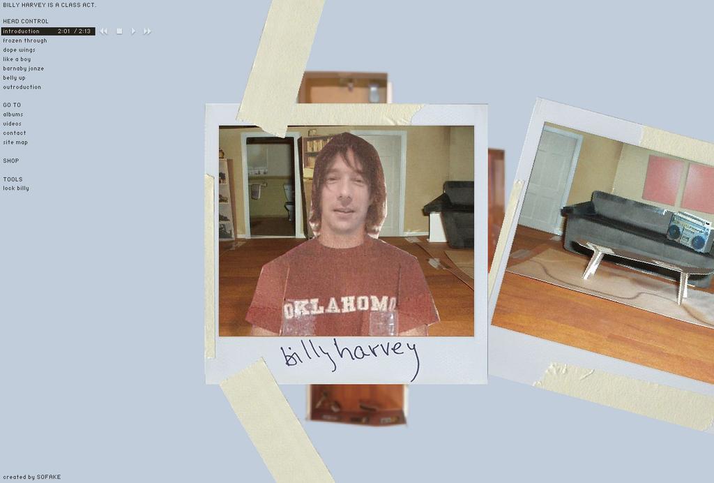
Billy Harvey Music Website
www.billyharveymusic.com

The use of mixed media is what I like most about this website. The frames of Poloroid photographs are used to form the main viewing area for the visuals, linked together by masking tape. This immediately gives the site a ‘real-world’ aesthetic and texture. Within the Poloroid photo area a collage of mixed media is used to represent Billy Harvey’s home and himself within it. A combination of photographs and cardboard cutouts are combined with moving video of Billy Harvey himself talking and singing. I like the way masking has been used so only Billy’s face is video, his hair and body being static images. This embeds the video into the collage aesthetic and also ensures that less bandwidth is required to view the site than if his whole body was video footage. The use of handwritten notes over the Poloroids also adds to the mixed media aesthetic of the site. The use of real-world collage gives the website a organic texture that stands out on the digital platform of the web browser. I particularly like the way in which these real-world elements combine with the digital media used in the site. When choosing to watch a video, the user selects a real-world video and the footage is embedded within a television set. The website also succeeds in transporting the viewer into a real landscape (Billy Harvey’s home), so after visiting the site the user is left with the impression they have actually visited a real place, rather than just a page within cyberspace.
The hypertext links on the left-hand side of the Billy Harvey website lets the site down in my opinion. The text does not appear to be in keeping with the aesthetic of the site and is often difficult to read when the Poloroids move underneath it. Web conventions dictate that links on the left side of the webpage enable users to navigate around the site. The Billy Harvey site breaks this heuristic by having links to different audio tracks rather than different visual areas on the top of the left-hand side of the page. These audio links are also not in keeping with the design of the site. It would have perhaps worked better if the user could choose audio tracks on a CD or record player, retaining the real-world aesthetic. There are also navigation links below, aiding the user to areas of the site. However they appear to be more of an afterthought of the design than an element conceived from the outset of the design.
A criticism of the Specialten DVD was the use of rollovers. An opaque pink block was used to illustrate to the user which button they were over. Although the colour was in keeping with the design of the interface, the rollover state obscured the white text of the button, making it difficult to read. It also seemed to dull the otherwise luminescent colours used in the graphics. I think the rollover state was used in too subtle a way for this DVD and I could not always see it on the screen. I found this was the case particularly when using a DVD projector, but also on a computer monitor. This meant that at times I was not always clear where I was navigating to within the interface, a problem that would be worse for someone with a visual impairment. I also felt that not as much thought had gone into this aspect of the DVD production. The rollover state offers another opportunity for creative experimentation in its use, but on this DVD it felt flat and conventional which was not in keeping with the overall creative design of the interface.
Billy Harvey Music Website
www.billyharveymusic.com
The use of mixed media is what I like most about this website. The frames of Poloroid photographs are used to form the main viewing area for the visuals, linked together by masking tape. This immediately gives the site a ‘real-world’ aesthetic and texture. Within the Poloroid photo area a collage of mixed media is used to represent Billy Harvey’s home and himself within it. A combination of photographs and cardboard cutouts are combined with moving video of Billy Harvey himself talking and singing. I like the way masking has been used so only Billy’s face is video, his hair and body being static images. This embeds the video into the collage aesthetic and also ensures that less bandwidth is required to view the site than if his whole body was video footage. The use of handwritten notes over the Poloroids also adds to the mixed media aesthetic of the site. The use of real-world collage gives the website a organic texture that stands out on the digital platform of the web browser. I particularly like the way in which these real-world elements combine with the digital media used in the site. When choosing to watch a video, the user selects a real-world video and the footage is embedded within a television set. The website also succeeds in transporting the viewer into a real landscape (Billy Harvey’s home), so after visiting the site the user is left with the impression they have actually visited a real place, rather than just a page within cyberspace.
The hypertext links on the left-hand side of the Billy Harvey website lets the site down in my opinion. The text does not appear to be in keeping with the aesthetic of the site and is often difficult to read when the Poloroids move underneath it. Web conventions dictate that links on the left side of the webpage enable users to navigate around the site. The Billy Harvey site breaks this heuristic by having links to different audio tracks rather than different visual areas on the top of the left-hand side of the page. These audio links are also not in keeping with the design of the site. It would have perhaps worked better if the user could choose audio tracks on a CD or record player, retaining the real-world aesthetic. There are also navigation links below, aiding the user to areas of the site. However they appear to be more of an afterthought of the design than an element conceived from the outset of the design.
posted by Alice Rothwell @ 12:07 pm
![]()
0 Comments:
Post a Comment
<< Home